كيف تخلي بطاقتك الرقمية تجيب ردوداً وعملاء

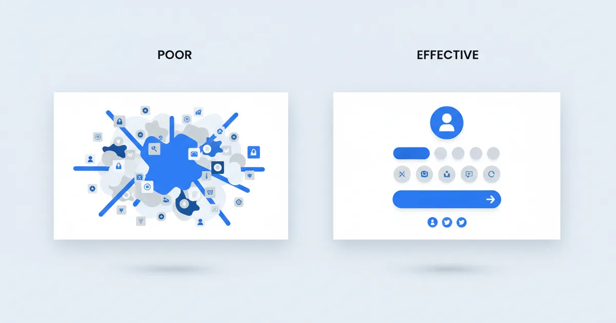
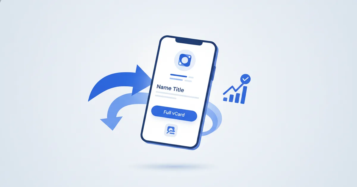
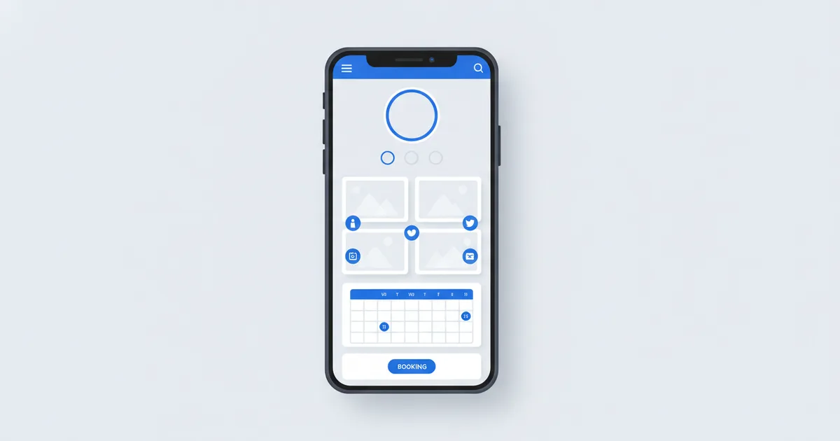
البطاقة الرقمية تجيب ردوداً عندما تجيب شاشتها الأولى عن ثلاثة أسئلة خلال خمس ثوانٍ: من أنت، وأي مشكلة تحل، وماذا يفعل الزائر الآن، مع واتساب كأسهل إجراء في الأعلى. جعل شخص يفتح بطاقتك الرقمية هو الخطوة الأولى، وجعله يتواصل معك فعلاً هو الخطوة الثانية، وهنا تفشل معظم البطاقات. المشكلة عادة ليست في المنصة بل في بنية البطاقة نفسها.
إليك كيف تبني بطاقة تحوّل المشاهدات إلى محادثات.
مشكلة الشاشة الأولى
عندما يفتح أحدهم بطاقتك على الجوال يرى نحو 400 بكسل من المحتوى قبل أن يحتاج إلى التمرير. ما تضعه في هذه المساحة يحدد هل يكمل القراءة أم يغلق الصفحة.
معظم المهنيين يقعون في الخطأ نفسه: الاسم واللقب واسم الشركة في الأعلى ولا شيء غير ذلك. هذا يعادل لوحة إعلانية تقول "أحمد، استشاري" بلا رقم هاتف.
ما يجب أن تجيب عنه شاشتك الأولى:
- من أنت؟ (الاسم واللقب)
- أي مشكلة تحل؟ (سطر تخصص، وليس مجرد مسمى وظيفي)
- ماذا أفعل الآن؟ (زر تواصل واحد واضح)
ترتيب أزرار التواصل حسب الأولوية
ليست كل قنوات التواصل متساوية. رتبها حسب الجهد الذي تتطلبه من الزائر:
| نوع الزر | مستوى الجهد | الأنسب لـ |
|---|---|---|
| زر واتساب | منخفض جداً، لمسة واحدة | الاستفسارات الجادة |
| حجز موعد | منخفض، ثلاث لمسات | أعمال الخدمات |
| مكالمة هاتفية | متوسط، يتطلب التزاماً | العلاقات القائمة |
| بريد إلكتروني | مرتفع، يحتاج جهداً | العروض الرسمية |
| نموذج تواصل | مرتفع، طابع مؤسسي | شركات B2B |
ضع واتساب والحجز في الأعلى والبريد في الأسفل. وهذا ليس ذوقاً شخصياً بل حيث يوجد جمهورك فعلاً: نحو 72% من مستخدمي الإنترنت في مصر على واتساب وفق بيانات Statista ليناير 2024، وتحصي DataReportal استخدام وسائل التواصل عند 80.1% من سكان الكويت في يناير 2025. وزر متجر واتساب الذي يملأ الرسالة الأولى مسبقاً يزيل آخر عائق أمام التواصل.
وليس كل زائر مستعداً للمراسلة أول مرة يفتح فيها بطاقتك. امنحه طريقة أقل التزاماً ليبقيك معه: بطاقة تُحفظ في المحفظة تضع بطاقتك في محفظة Apple أو Google لديه، فالزائر الذي لم يكن جاهزاً للحجز اليوم يبقى على بعد لمسة الأسبوع القادم، والبث للحاملين يتيح لك إعادة عرض جديد على كل من حفظها. هكذا تتحول المشاهدة الصامتة إلى جهة اتصال تصل إليها ثانية، على iPhone وأندرويد وبلا تطبيق.
ما تضيفه وما تحذفه
أضف:
- صورة مهنية: ليست خياراً في الأعمال القائمة على الثقة، فالناس يتواصلون مع وجوه
- سطر تخصص محدد: "معماري متخصص في التصميم السكني المستدام في دبي" أفضل من "معماري"
- من خدمة إلى ثلاث خدمات رئيسية: بوصف موجز وسعر إن كان مناسباً
- دليل اجتماعي: اقتباس شهادة عميل أو شريط شعارات عملاء
- نطاق جغرافي واضح: مهم خصوصاً في الخليج حيث يخدم المهني عدة دول
احذف:
- كل حسابات التواصل التي تملكها: اختر اثنين كحد أقصى، بطاقة فيها 12 أيقونة تشتت الانتباه
- عنوان المكتب العام: إن كان العملاء لا يزورونك فهو مساحة ضائعة
- نبذة "أنا مهني شغوف بخبرة 10 سنوات": لا تقول للقارئ شيئاً يمكنه التصرف بناء عليه
- أرقام هواتف متعددة: اختر الرقم الذي تجيب عليه فعلاً، فالرقمان يصنعان حيرة
الصورة الشخصية: إشارة الثقة
الناس يتواصلون مع أشخاص لا مع شعارات. الصورة المهنية الحقيقية تتفوق على ملف يحمل شعاراً فقط لأنها تجيب عن سؤال الثقة قبل أن يقرأ الزائر كلمة واحدة، بينما قد تعمل صورة السيلفي ضدك في أسواق رسمية مثل الرياض وعمّان.
الغريب يقرر هل يراسلك أم لا قبل أن ينهي تمرير شاشتك الأولى.
الاستثمار في صورة مهنية واحدة جيدة يعوض نفسه خلال أشهر. وإن كان جمهورك عربياً بالأساس، تأكد أن الوجه العربي لبطاقتك يُقرأ بطبيعية مثل الوجه الإنجليزي.
سطور التخصص التي تعمل
الصيغة الأكثر فاعلية: التخصص، ثم الجمهور أو السياق، ثم النتيجة أو الأسلوب.
أمثلة:
- "استشاري ضرائب لشركات المقيمين في الإمارات والأردن"
- "مصور زفاف في الرياض بأسلوب عصري"
- "أخصائي علاج طبيعي للرياضيين والتعافي بعد العمليات في الكويت"
قارن مع: "استشاري محترف" أو "مصور ذو خبرة" أو "أخصائي صحة". كلها بلا فائدة.
حلقة التحليلات
بعد إطلاق البطاقة استخدم التحليلات لفهم ما ينجح:
- مشاهدات عالية ونقرات واتساب منخفضة: الملف يبدو جيداً لكن زر التواصل مدفون أو غير واضح
- مشاهدات منخفضة: أنت لا تشارك البطاقة بما يكفي أو في الأماكن الصحيحة
- معرض الأعمال ينال نقرات أكثر من التواصل: أبرز أعمالك أكثر واجعل خطوة التواصل طبيعية بعد التصفح
- المشاهدات تقفز بعد الفعاليات: بطاقتك تعمل في سياقات التعارف، عزز ذلك
اختبر بطاقتك قبل النشر
- هل يفهم الغريب ماذا تعمل خلال خمس ثوانٍ؟
- هل هناك خطوة تالية واحدة واضحة؟
- هل تبدو البطاقة احترافية على iOS وأندرويد معاً؟
- هل يملأ زر واتساب رسالة مسبقة؟
- هل هي متاحة بلغات عملائك الأساسيين؟
إن أجبت بلا عن أي سؤال، عالجه قبل فعاليتك القادمة. تتوفر خطة مجانية وخطط مدفوعة من 7.99 دولار شهرياً عبر صفحة الأسعار.
الأسئلة الشائعة
شو أول شي لازم يظهر على الشاشة الأولى للبطاقة؟
اسمك ولقبك، وسطر تخصص يسمي جمهورك والنتيجة التي تقدمها، وزر تواصل واحد ظاهر. كل ما عدا ذلك مكانه أسفل الشاشة الأولى.
واتساب ولا الإيميل يكون الزر الرئيسي؟
واتساب في كل أسواقنا تقريباً: لمسة واحدة، وهو حيث يتحادث العملاء أصلاً، والرسالة المسبقة تخفض الحاجز أكثر. البريد مكانه أسفل البطاقة للعروض الرسمية.
كم رابطاً يجب أن تحمل البطاقة؟
حسابان اجتماعيان كحد أقصى مع أزرار التواصل الأساسية. كل رابط إضافي يسرق نقرات من الروابط التي تهم فعلاً.
كيف أعرف أن بطاقتي تعمل؟
راقب نسبة المشاهدات إلى نقرات واتساب في التحليلات. مشاهدات عالية بنقرات قليلة تعني أن زر التواصل مدفون أو السطر التعريفي غامض، ومشاهدات قليلة تعني مشكلة مشاركة لا مشكلة بطاقة. راجع الأرقام مرة كل أسبوع وعدّل عنصراً واحداً في كل مرة حتى تعرف بدقة أي تغيير رفع النتيجة، فهذه هي الطريقة الوحيدة لتحسين حقيقي يمكن قياسه بدل التخمين.